Quickly explore your AWS Bill with our new widget! This widget uses the AWS Services Cost report to present cost data on your favorite dashboard. There are three main views for the Cost Explorer Widget: period comparison, service total, and doughnut.
To Add a Cost Explorer Widget to Your Dashboard:
- Open an existing or create a new dashboard.
- Click + Add Widget.
- Click Add on the Cost Explorer widget card.
- Select your preferred Visualization and Time Range.
- Name the widget.
- Click Save.
Visualization Options
Period Comparison
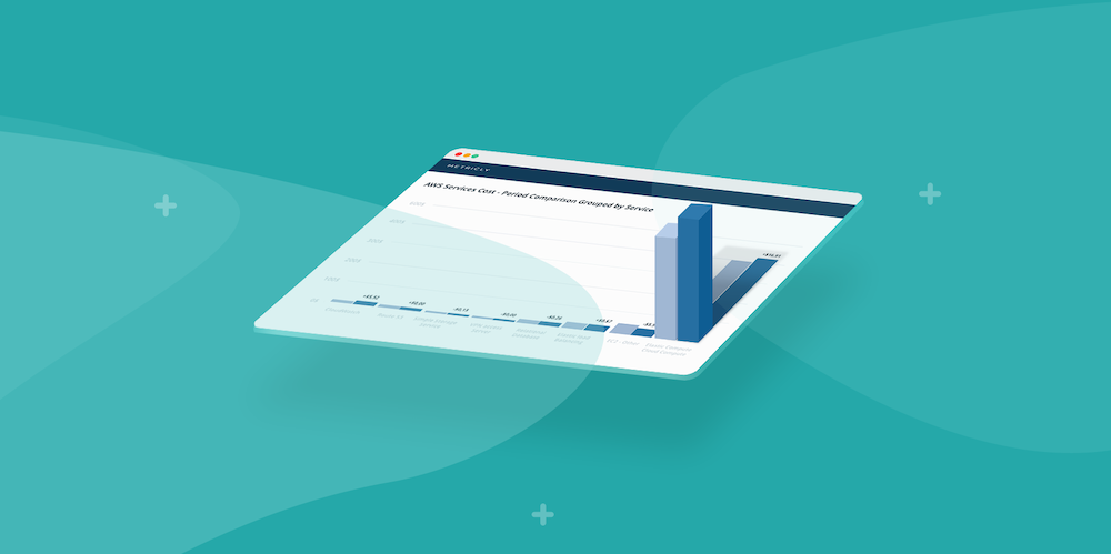
The Period Comparison view enables you to select a current timeframe (day, month, 6 months, etc) and compare its previous time frame interval. For example, the below screenshot shows a current 6 month period of *May 16, 2018 – November 15, 2018 *and a previous 6 month interval of *November 16, 2017 – May 15, 2018*.

Service Total
The Service Total view displays a traditional bar graph that contains spend data corresponding with the designated time range.

Doughnut
The Doughnut view is great for comparing the spend of each service in relation to your overall AWS bill.

Promoting a Culture of Savings
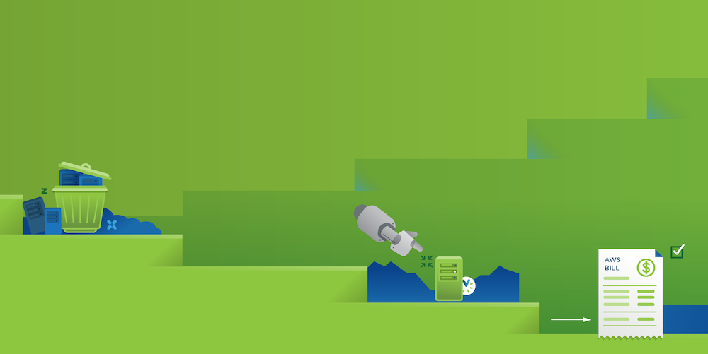
Metricly believes that a culture built on communication, routine, and best practices is the key to success. Features like our new Cost Explorer widget allow you and your stakeholders to stay proactive against creeping costs by communicating a clear understanding of where your costs are today in relation to the past—without bogging you down with extra work to do.
Curious About Our Other Beta Features?
We now tag beta features in our help docs to make it easier for you to keep track of upcoming features. Whenever we push a new feature into beta, you’ll find it there with a link to any supplementary documentation.
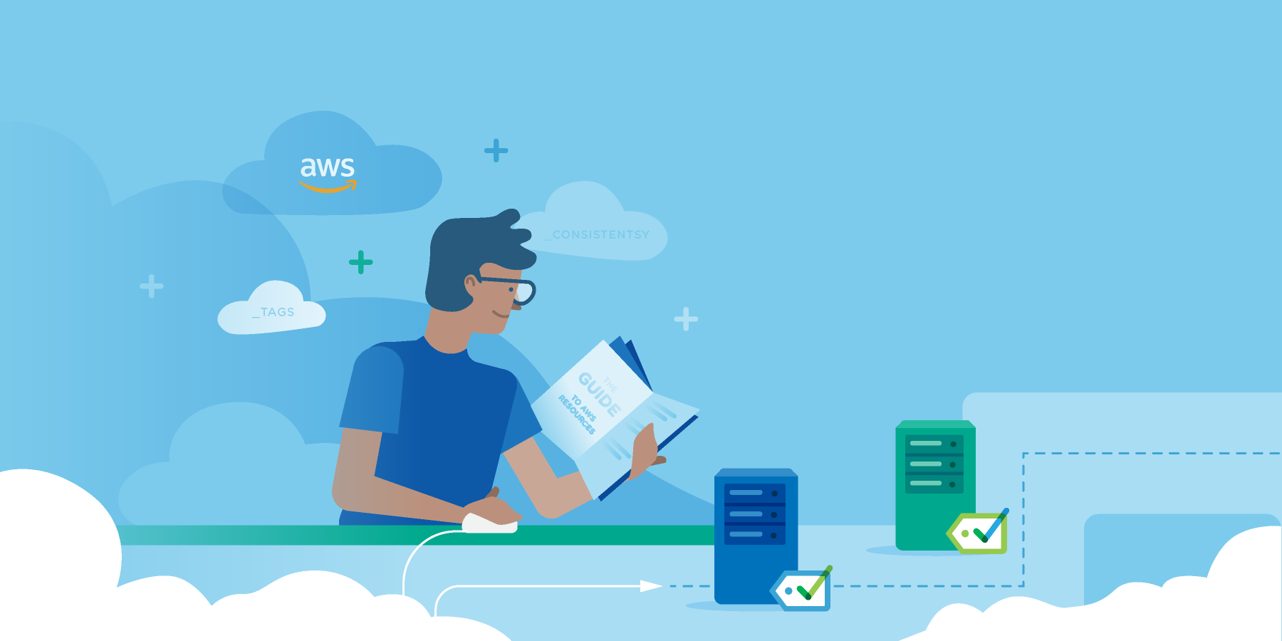
Metricly coaches users throughout their cloud journey to organize, plan, analyze, and optimize their public cloud resources.
Try Metricly FreeAbout the Author

Lawrence Lane
Lawrence Lane writes for Metricly’s blog, news letter, and help documentation. When he isn’t writing, he’s probably watching Netflix’s latest sci-fi series or out taking pictures of old buildings.