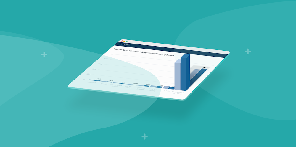
Ever wanted to visualize how your AWS environments are doing from a geographic perspective? With our new Alerts widget, you can do exactly that–and more–with just a few clicks in the UI. You can find this new widget by creating a dashboard or opening the widget menu on an existing dashboard. The Alerts widget will have three options: maps, heat maps, and a ticker.
Today, we are happy to be releasing the Maps option for this widget type. Read on to see why it’s great for displaying on your team’s shared TV.
What does the map show?
Nodes
The number of nodes (and their placement) is determined by the AWS regions they belong to. If all of your elements belong to a US West Coast data center, for example, you will only see one node. Elements that don’t have a clear geographical label are designated to 0° Longitude, 0° Latitude; this is shown below as the red 8 and 5 nodes.

Color Key
Nodes can be four colors: green (none), blue (info), orange (warning), and red (critical). These correspond to the level of the configured policy. A node takes the color of the highest-level policy that is firing. If there are 20 info-level policies firing and 1 critical policy firing on your US West Coast node, it will be red.
What actions can I take using the map?
When you click on a node, a modal presents several different options.
Actions
- View Element Summary: lands on the element summary page associated to the policy.
- View Violating Metrics: displays all violating metrics associated to the policy via the metrics tab.
- Edit a Policy: opens the policy editor for that specific policy**.

Are there different grouping options for the nodes?
There are two grouping options: group by elements, and group by policies. Both options can scope based on attributes and tags.The chosen grouping method does not change the number of firing alerts each node displays when selected; it does, however, change the node’s count to reflect how many elements or policies are being affected by the firing alerts.
How long are alerts counted on a node?
The duration setting of your dashboard controls the count. If you want short alerting lists, we suggest you either pick a brief duration for your dashboard or create multiple maps for your that each monitor specific criteria.
Metricly coaches users throughout their cloud journey to organize, plan, analyze, and optimize their public cloud resources.
Try Metricly FreeAbout the Author

Lawrence Lane
Lawrence Lane writes for Metricly’s blog, news letter, and help documentation. When he isn’t writing, he’s probably watching Netflix’s latest sci-fi series or out taking pictures of old buildings.